Post Modern Art
Post-Modern Art took on an approach of drastic changes. To push
the boundaries of Architecture, and sculptures that utilized the world as we
have it. Environmental art and Architecture are the two facets of Post-Modern
Art I will be touching on for this blog. Specifically, the crazy lengths of one
Architect by the name of Frank Gehry, the historical significance of one
sculpture Maya Lin, and Environmental Artist Andy Goldsworthy’s incredible work
with Nature.
ARCHITECTURE
Every Architect has a sort of language, this is called a design
philosophy. Gehry’s design philosophy is that of deconstructivism, taking down
the typical box-like structure of buildings, and making new forms that defy
logic and sometimes gravity. Having a strong dislike for the monotony of an
average building led Gehry to take the old and make something new, specifically
he focused on the human portion of deconstructivism. This means that he made it
a point to construct forms that transformed those who experienced it, for the
better. His buildings were known for their undulating freeform sculpture-like
designs, that still managed to provide stability and function. He used computer
technology to engineer solutions that would provide blueprints to ensure structural
integrity.


Guggenheim Museum Bibao by Frank Gehry, 1997
The Guggenheim Museum has little to no symmetry and looks at first like a chaotic structure of titanium. In fact, Gehry designed this building to flow in ways that most architects would cringe at. Built with titanium and interconnecting limestone masses to solidify the structure. This is a deconstructive design that focuses on defying gravity. Using the reflection of the titanium to provide different lighting throughout the day, the perspective of this structure changes as different light hits it. Providing an overwhelming experience, both from the exterior of the building and interior.
Here is a short video that explores the Guggenheim Museum, a
Freerunner and a photographer shoot for photos that will defy gravity, allowing
you to experience the Guggenheim differently.


The American Center in Paris by Frank Gehry, 1994
SCULPTURES

The Vietnam Veterans Memorial in Washington DC by
Maya Lin, 1982
Thick granite slabs were designed to form a large V, with
its un-connected ends pointing towards the Lincoln Memorial and Washington
Monument. Maya Lin’s design was initially met with such outrage and contention,
she had to pause her studies to defend the design. Even then there were a lot of
different perspectives revolving around what she meant behind the sculpture, Lin’s
design was meant to unify society’s sorrow from the losses incurred during the
war. There is no underlying lesson of what war means, or how one should think
about the war. Rather a reflective monument meant to bring forth thoughts of
the reality behind the depth of sorrow that had resulted from such a war. Not
only did Anti-war and Anti-military loss families and acquaintances but those
who supported the war as well, in other words it didn’t matter the feelings
behind the war we all lost in some fashion.
Lin designed the monument to reflect 58,000 different soldiers in order of loss or execution, rather than alphabetically to portray an almost Greek poem-like tale. Somehow Lin’s sculptures were defined as minimalistic sculptures, despite the large difference in feelings and perspectives they brought forward. All of Lin’s work is developed and designed for light reflections, meaning that her sculptures change as the light changes. Both the Vietnam Veterans Memorial and this next piece, the Wave Field change with light and sometimes provide different perspectives no matter where you stand.
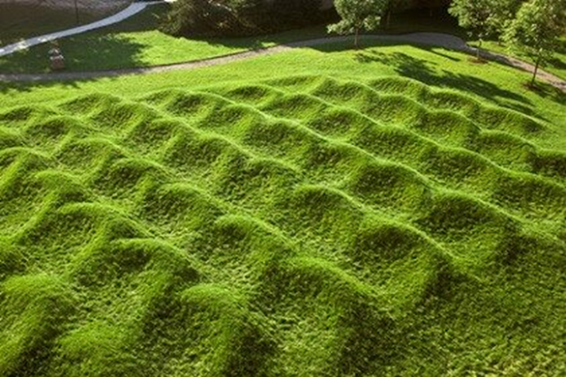

The Wave Field by Maya Lin, 1995
This piece was inspired and influenced by the movement of
water, Lin designed and manipulated the landscape to reflect the waves in our
oceans. Made with grass and earth. Lin’s minimalistic design is based on the human
perspective as well, as their thoughts and feelings through its form.
Goldsworthy an artist that manipulates nature to form art, an often unwilling material.

Laid across oak boughs to make shadows on the ground below,
Dumfriesshire, Scotland, 2014
Environmental Art intrigues me as it is an interpretation
based on Nature itself. For those of us who find ourselves more nostalgic or
whimsical during rain storms, or rearing to go on those hot sunny days. We have
developed different perspectives reflective of the weather. Environmental
artists find a perspective from different pieces of nature during different
times. Goldsworthy has taken a branch and photographed its shadow across the
journey of a day. Though this may seem boring to some, the sheer genius at the
actual realization that this shadow will travel and tell a different story
during different lighting shows the creativity and art behind this method.
Goldsworthy’s art is based on the inevitable death of all living things. Though there is death all around, there is also light. His pieces utilize light and shape in both perspective and meaning. His designing and methods are rather different from most, in that there is no prior working or developing, no tools taken to the sight, and no plan. He simply walks nature and finds a spot that looks like art to him. There is always a sense of infinite possibilities when it comes to the pieces that Goldsworthy produces, leaving one with a vast array of meanings to pick and choose from. As a sculptor Goldsworthy uses wood, bone, grass, and stone. Usually constructing openings, thresholds, arches, spirals, webs, coils, or lines of color in a field. Most are temporary but for the photographs taken of that one moment in time.

The Storm King Wall, by Andy Goldsworthy, 1998
Though this wall seems made to last, there is no mortar to bind
the stones, no supports meant to keep them in place, they are simply placed in
such a way they hold their form. This wall is meant to represent agricultural
borders and dairy walls used in New England and New York in the 18th
and 19th centuries. A work that spanned over 17 days with five men
and over 250 tons of stones from the Storm King Grounds.
For some, this wall is hypnotic and mesmerizing, while others find it aesthetically pleasing. Though it has a winding pattern through the trees, it isn’t meant to be defined as such. Rather just a free-flowing form of stones through a forest into the water, Goldsworthy would have us view it as a spirit in stone.
REFERENCES:
Maya Lin Art, bio, ideas (no date) The Art Story. Available at: https://www.theartstory.org/artist/lin-maya/ (Accessed: November 22, 2022).
Storm king "running" wall (2018) American Scientist. Available at: https://www.americanscientist.org/article/storm-king-running-wall (Accessed: November 22, 2022).
Frank Gehry (no date) Encyclopædia Britannica. Encyclopædia Britannica, inc. Available at: https://www.britannica.com/biography/Frank-Gehry (Accessed: November 22, 2022).

Hi Jasmine,
ReplyDeleteI liked the wide variety of art that you shared in your blog. Some of the art pieces are quite interesting and unique. The Guggenheim Museum Bilbao looks cool. It must have taken Frank Gehry a long time to design the building so that it would be strong. It also must have been quite challenging to build, since there are so many different complicated curves that are incorporated into the building. A majority of the edges that can be seen on the building are curved lines, as there are a bunch of curved walls that the museum is made up of. I believe that Gehry designed the building this way, to portray the feeling of comfort and ease. He did this to draw us in, as it allows us to know that we can be comfortable and at ease, as we relax to enjoy the art that can be found inside the museum.
I like the American Center in Paris, which was also designed by Frank Gehry. It is such a crazy-looking building, with all of the curved walls, as well as with all of the rooms in the building that are overhanging above nothing. Similarly to the Guggenheim Museum Bilbao, it must have taken a lot of work for this to have been designed in a way that it is a stable building. It also must have been pretty hard to build the overhangs of the building, as there is nothing below that they could have used for support during the building process. They had to build the overhangs in the building, on top of the fact that they were building curved walls. I like that the building was designed with a bunch of vertical lines, so we would know that the building is strong and sturdy, even though there are a bunch of overhangs incorporated into the building.
The Vietnam Veterans Memorial is quite impressive. It must have taken a long time to get all of those names engraved on those slabs of granite. It is quite a large memorial, it is crazy that there are a little more than 58,000 names on the memorial. I like that they spent so much time and effort making the memorial, to remember those who died in the Vietnam War. I like how there are a bunch of vertical lines that have been created by the individual stones that are touching one another. I believe the memorial was designed with these vertical lines to show strength. It was made this way so we would remember that the soldiers that died were strong and that they put forth all of their effort up until the point that they died.
I like the “Wave Field” that was completed by Maya Lin. I could see someone having the random idea to create “waves” in the ground, but it is cool that she went through with it, after coming up with the idea. It must have taken quite a while to move all of that dirt around, as well as a lot of skill to get the dirt mounded up into such smooth piles that look so similar to one another. It is cool that she made the ground look so much like a field of waves. I believe that this piece of landscape art was unintentionally created with a bunch of curves to portray comfort and ease. This was done so we could realize that we can be comfortable and at ease as we are outside, on the fields of grass.
I will admit that Andy Goldsworthy’s shadow art is not some of the art that I am very fond of, but it is pretty cool that he can create things with the shadows of tree branches. It is cool to see the human that was made by the tree branches. The man that can be seen in the shadows is made up of only a few thick lines, which I believe is to show that the person is strong, as he seems to have a bit of a heavier build.
I am also not very fond of the “Storm King Wall” that was made by Andy Goldsworthy, but it is pretty impressive that it was built. I find it impressive that the stones are not bound together by any mortar or anything. It is also impressive that it is made up of 250 tons of stone that was put together by only five men over a total of 17 days. I believe that the wall was made to be a curved line that winds back and forth around the trees, so we can know that we can be comfortable and at ease as we are enjoying ourselves, going for a walk through the trees.
The art work in this blog really caught my eye! I am more into paintings of nature however, from all the art pieces in your blog I like the first two the most. Although there are some art pieces, I feel like they are too bland for me and it portrays a feeling of isolation. The first two paintings seem really cool to me and they are something I would hang in my own home.
ReplyDeleteI really enjoyed this blog in that it focuses solely on architectural and environmental design. In the art world, I feel like these styles go unnoticed; however, they should be rewarded with just as much attention. The work of Frank Gehry is absolutely fascinating. The utilization of deconstructivism is truly unique, and it does look like the structure will crumble to the ground with how much it is defying gravity. Gehry took something that was known to function architecturally but adjusted it just enough to still function while also creating a piece of art that is beyond what many thought was possible. I was shocked when I saw the photos of Guggenheim Museum Bibao (1997) in your post. I truly though it was a ship: the way that one end comes to a point, creating the illusion of the bow, while also reflecting onto the water below as if it is at sea, is absolutely breathtaking.
ReplyDeleteMaya Lin’s, The Vietnam Veterans Memorial (1982) has a presentation like no other. While rather simplistic in design, if one looks deep enough, the symbolism within the work begins to show. The small detail of creating these two linear lines that point to both the Lincoln Memorial and the Washington Monument is powerful in itself. It is clear, however, that Lin wanted to make the names of the 58,000 soldiers the focal point of the piece, in order to remember those who gave the ultimate sacrifice for ours. The names being white against the solid black granite base emphasize each and every individual behind those names. The use of this dark, reflective base allows the visitors to see their reflection against the granite, as if they themselves are looking into the “other world” in which the soldiers reside.
https://smarthistory.org/seeing-america-2/vvm-sa/
Hi Jasmine! Frank Gehry’s architecture designs are quite amazing. It’s always interesting to see how unique people can design buildings. For the Guggenheim Museum, It’s amazing how there is no symmetry to the building and has a lot of curves where they aren’t typical of in a building. It’s very whimsical in a sense. I do like how there are a sections of windows that allow color to come through the building. Although, I wonder why he used a very gray color palette for his design I still think it’s amazing. I see that the material used is for reflecting the environment around it. I would love to see this in person to get a full feel for what his intentions were. At first glance I thought it was a boat since a few of the upper levels seem to remind me of the stacks on the Titanic. Although it’s not a painting, the building’s outer walls definitely show a range of different hues of grays depending on the light reflecting on it.
ReplyDelete